How we rethought every screen of our point-of-sale system to bring modern design to the firearms industry
The problem
If you’ve ever worked behind the counter at a gun shop, you know the software. Clunky interfaces built in the early 2000s, screens crammed with every possible button, and layouts that feel like they were designed by database engineers rather than the people who actually use them eight hours a day. Our POS system had grown the same way — functional, yes, but with a user experience that had accumulated years of feature additions without a cohesive design pass.
We set out to change that. Not by removing features — a firearms POS has genuinely complex requirements — but by rethinking how all that information is presented. The goal was simple: build something that a cashier would actually enjoy using. Something that felt like it belonged in 2026, not 2006.
The terminal: where every transaction starts
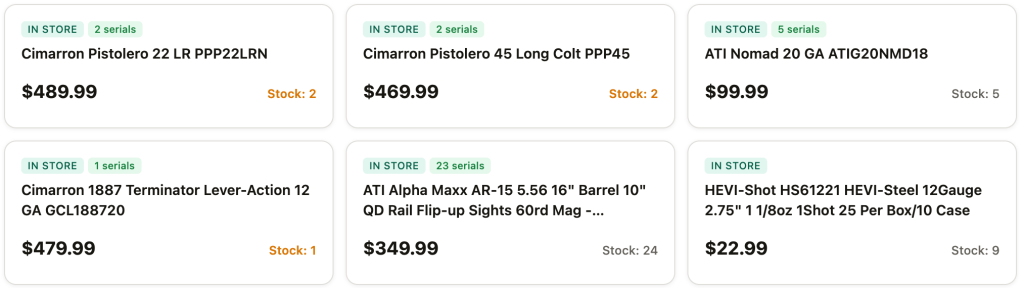
The terminal screen is the heartbeat of the POS — it’s where cashiers spend 90% of their time. The original design used large product cards in a three-column grid, each card showing the product name, SKU, UPC, price, stock count, an “In Store” badge, and an “Add” button. All at once. Every card was a wall of text competing for attention.
Progressive disclosure on product cards
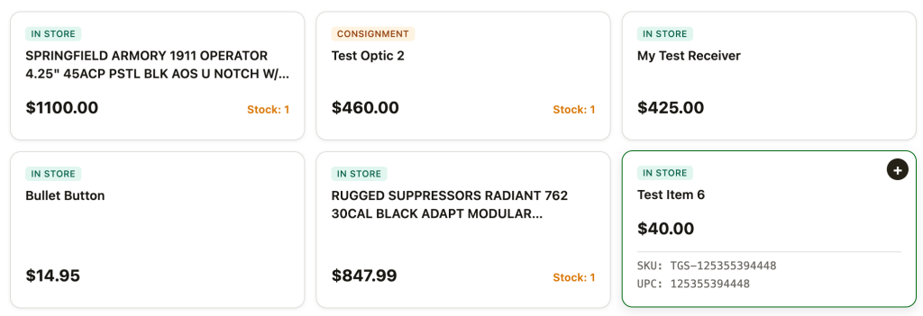
The single biggest improvement was embracing progressive disclosure. A cashier scanning the product grid doesn’t need to see the SKU and UPC for every item simultaneously — they need the product name, price, stock level, and a way to add it. So we stripped the cards down to just that: name (up to two lines), price, stock count, and type badges. The SKU and UPC are revealed on hover with a smooth expand animation. The information is still there, exactly when you need it, without cluttering the default view.
Whole-card click targets
In the original design, adding an item to the cart required clicking a small “+ Add” button in the corner of each card. When you’re processing a line of customers, that’s a lot of precision clicking. We made the entire card a click target. Tap anywhere on the card and it adds to cart. The “+” button still appears on hover as a visual hint, but the whole surface is active. A subtle press animation (the card scales down to 98.5% and snaps back) gives tactile feedback that something happened.
The flying dot
When you add an item, a small green dot launches from the center of the card and arcs across the screen to the cart badge in the sidebar. It uses separate horizontal and vertical easing curves to follow a natural parabolic arc rather than a straight line, and leaves a trail of fading particles behind it. When it arrives, the cart count badge pulses to “receive” it. This takes about half a second and runs independently for each click, so rapid-fire adding still feels responsive. It’s a small thing, but it’s the kind of detail that makes the software feel alive rather than mechanical.
Low stock indicators
Items with low stock now have a small red dot that gently pulses next to the stock count, drawing the cashier’s eye without being obnoxious. Combined with the red text color for zero-stock items, it’s immediately clear which products are running low. The “Stock: X” label format (replacing the bare number from an earlier iteration) makes the meaning unambiguous at a glance.
Payment options: the expandable drawer
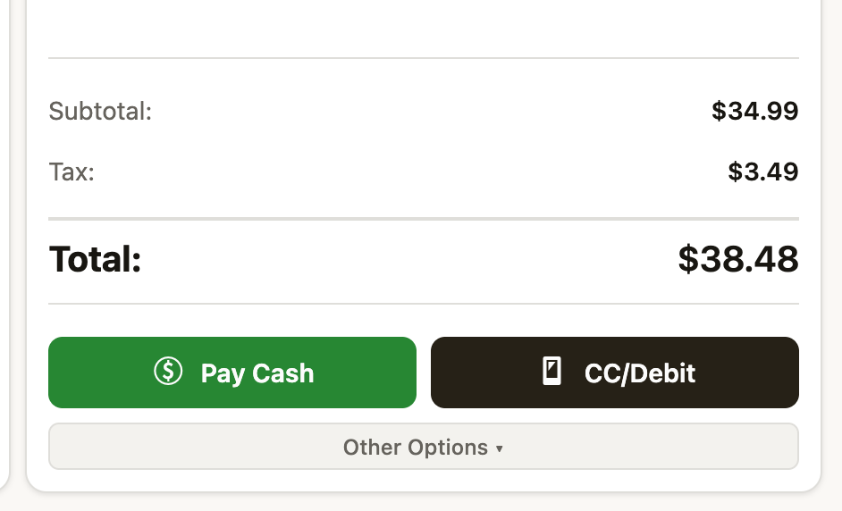
The original design had six brightly colored payment buttons permanently visible: Pay Cash, Dejavoo Terminal, Other Payment, Gift Card, Layaway, Buy From Customer, Hold Order, and Clear Cart. It was a rainbow of options that competed with the actual transaction. We simplified this to two primary buttons (Pay Cash and CC/Debit) that are always visible, with everything else tucked behind an “Other Options” expandable drawer. The primary buttons even have a dormant state — they’re grayed out when the cart is empty and animate to full color when there’s something to pay for. The interface comes alive when it’s ready for action.
Rethinking the cart sidebar
Stacked layout for long product names
Firearms products have notoriously long names. “Springfield Armory XD Mod.2 Sub-Compact Extended Handgun Magazine .45 ACP 13/rd” is a real product name. In a narrow cart sidebar, a single-line truncation makes items indistinguishable. We switched to a stacked two-row layout: the product name gets the full sidebar width (up to two lines before truncating), and then a second row shows the per-unit price, quantity stepper, and line total. This gives the name roughly four times more space than the original inline layout.
Serial number display
Serialized firearms need their serial number visible on the transaction. We added a subtle serial number row that appears between the product name and the price line for serialized items. It uses a monospace font with a small lock icon and a neutral gray background — visible and scannable without visually competing with the product name or price. Non-serialized items simply don’t show this row, keeping the cart clean.
The topbar: fitting everything in

Our POS has nine navigation tabs (Terminal, Orders, Range, Members, Drawer, Work Orders, Consignment, Layaway, Pickups), plus the cashier name, a station badge, a switch-user button, a live clock, and a fullscreen toggle. Cramming all of that into a single 48px bar was technically possible but felt suffocating.
We moved to a two-tier topbar. The upper tier is a slim 32px info bar with the brand, cashier identity, station badge, and clock. The lower tier is dedicated entirely to navigation. The extra 32 pixels of vertical space is a worthwhile trade — it completely eliminates the cramming problem and lets the navigation breathe. This is the same pattern used by Shopify POS and Square for the same reason.
The active tab has a sliding pill indicator that smoothly animates between tabs rather than just swapping, and the clock ticks live down to the second — small touches that make the interface feel responsive and alive.
The orders page: unifying held and completed
The original orders page was essentially two separate interfaces stitched together. At the top, large summary cards (Total Sales, Cash Sales, Card Sales, Total Orders, Paid Orders, Pending Payment) each took up significant vertical space. Below that, held orders lived in their own section with yellow-tinted cards. Below that, a full-width tab bar filtered a separate order list. It was a lot of scrolling before you got to the actual orders.
The metrics strip
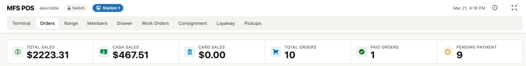
We compressed the six summary cards into a single horizontal metrics strip at the top of the page. Each metric is a compact cell with a small icon, the value, and a label — all in about 56 pixels of vertical space versus the 200+ pixels the original cards consumed. The same information is there, but it’s glanceable rather than dominating the page.
Held orders: always visible, horizontally scrollable
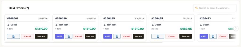
The original held orders section used large yellow-tinted cards in a wrapping grid that took up a huge amount of vertical space. Each card was packed with buttons — 4473, a clipboard icon, Cancel, and Resume — making them visually heavy.
We kept held orders as a permanent, always-visible section (they’re too important to hide behind a toggle — a cashier needs to see at a glance that there are orders waiting) but compressed the presentation significantly. The section has a clean “Held Orders (7)” header with its own search field, and the cards themselves live in a single horizontally scrollable row. Each card is compact: order number, date, customer, item count, price, and the essential action buttons (4473 where applicable, Cancel, Resume). An arrow button on the right edge and a clipped last card make it obvious there are more to scroll to.
This approach preserves the at-a-glance visibility that held orders need while reclaiming most of the vertical space that the old wrapping grid consumed. The horizontal scroll also scales better — whether you have 3 held orders or 15, the section takes the same amount of vertical space.
Cleaner order rows
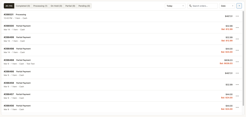
Each order in the list is now a single row with a colored left-edge bar indicating status (amber for partial, green for completed, blue for processing, gray for pending). The order ID and status badge sit on the first line, with date, customer name, item count, and payment method on a meta line below. Amounts are right-aligned, and orders with an outstanding balance show it in red beneath the total.
We originally had action buttons (receipt, print, view, collect balance) appear on hover, but this left a large empty gap on the right side of every row. Instead, we settled on showing a primary “Collect” button for orders with a balance and a three-dot overflow menu for secondary actions. Every row has the same visual weight whether it has a balance or not.
The details that add up
Beyond the structural changes, we invested heavily in micro-interactions and polish. None of these are individually game-changing, but together they’re what separate software that feels good from software that merely functions:
- Staggered card animations — products cascade in on page load rather than all appearing at once
- Card hover lift — cards rise 2px with a deepening shadow on hover, using cubic-bezier easing for a snappy-but-smooth feel
- Animated checkmark toast — a green circle with an animated checkmark pops in when adding to cart, more satisfying than a text label
- Quantity stepper pop — the number in the cart quantity control bounces with a spring animation when changed
- Total flash — the cart total briefly flashes green when it changes so the cashier’s eye catches the update
- Keyboard shortcut — press / to focus the search bar, with a subtle keyboard hint badge that fades on focus
- Ripple effect on pay buttons — a material-design ripple on click for tactile feedback
- Subtle noise texture — an almost-invisible grain overlay on the background gives it a paper-like quality rather than dead-flat digital
- Cart item slide-out — removed items slide to the right and fade before disappearing, rather than instantly vanishing
What we learned
The firearms industry has accepted bad software for too long. Dealers tolerate clunky interfaces because they assume that’s just how POS software works. But the same cashier who suffers through a 2005-era interface at work goes home and uses apps that respond to every touch with fluid animations and thoughtful layouts. The gap between what people experience in consumer software and what they’re given at work is enormous — and it doesn’t have to be.
None of the changes we made removed functionality. Every SKU, every UPC, every serial number, every payment option is still there. What changed is when and how that information appears. Progressive disclosure, consistent visual hierarchy, and thoughtful micro-interactions don’t just make software prettier — they make it faster to use, easier to learn, and less exhausting over an eight-hour shift.
If your cashiers are fighting your software instead of serving your customers, the software is the problem. It doesn’t have to be.